
JKC Wellness
Client: JKC Wellness
Project Type: Web Design, Brand Identity, Print Design, Mobile App
Competencies: Photography, Typography, Layout, Illustrations
Software: Illustrator, Photoshop, CapCut, Figma
Branding & Web Design
Client: JKC Wellness
Project Type: Web Design, Brand Identity, Print Design, Mobile App
Competencies: Photography, Typography, Layout, Illustrations
Software: Illustrator, Photoshop, CapCut, Figma
I was inspired by the many massage and anatomy apps available, but quickly noticed a common problem: users often had to switch between multiple separate apps just to learn anatomy and follow massage guidance. This made finding information confusing and interrupted the flow of self-care. The real challenge was how to bring all of these helpful tools together in a way that felt seamless and easy to use.
JKC Wellness' main colors has always been a deep blue with hints of white and light gray. I wanted to have some pop of colors—although not a part of my traditional wheel house, there are subtle hints of gold & copper in my treatment room.
For the typeface, I wanted a sense of elegance and classical proportion. Orpheus Pro delivered a refined yet understated sophistication, creating contrast that reinforces visual hierarchy and interest. For the primary typeface, I sought a design that was clean, versatile, and welcoming—qualities that perfectly align with my brand's personality, which Lato successfully fulfilled.
In an unconventional approach, I wanted a broader range of colors than the typical 3-6-color palette. I preferred additional color options—not bright primary hues, but more nuanced tones that would complement the warm feel of my room. Along with expanding the selection, I created muted shades, which, to my surprise, worked beautifully as subtle accents alongside the simple line illustrations and icons.
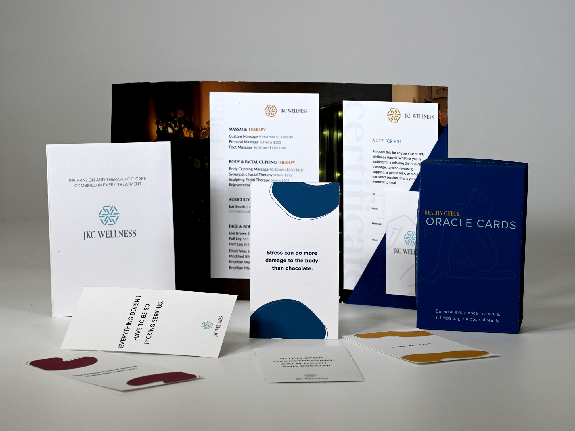
Gift Certificate booklet with Business Card and Price List, 4 fold Menu, & Oracle Cards
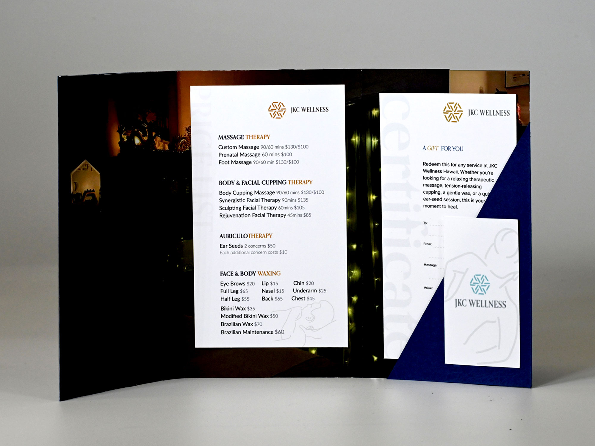
Gift Certificate booklet with Business Card and Price List
Gift Certificate booklet with Business Card and Price List
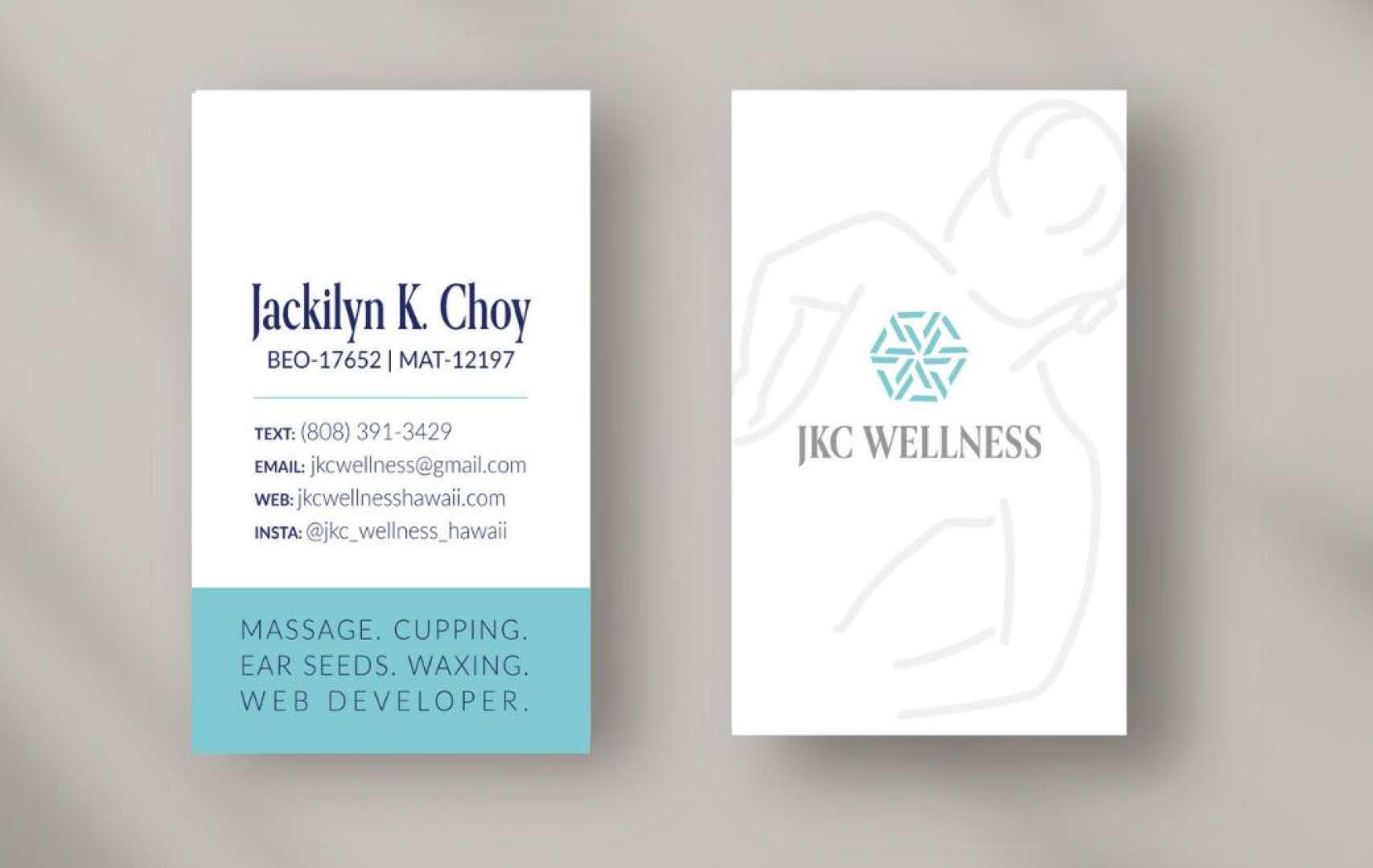
Gift Certificate booklet with Business Card and Price List
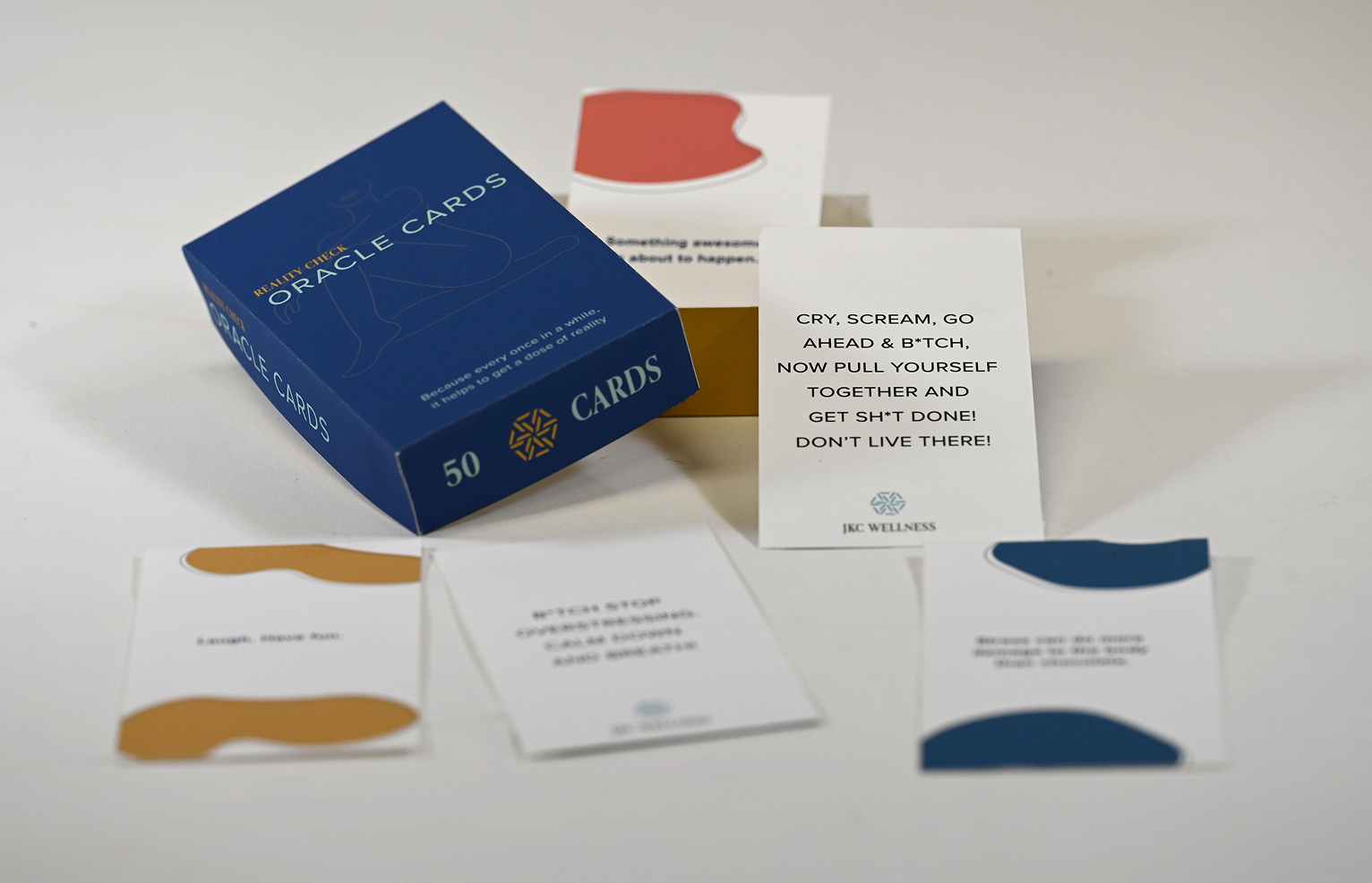
Gift Certificate booklet with Business Card and Price List
Gift Certificate booklet with Business Card and Price List


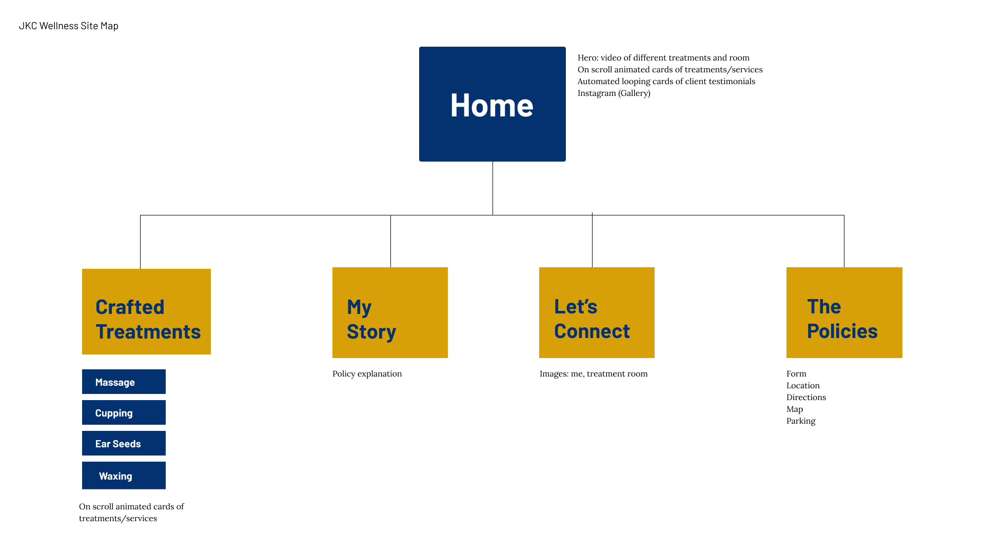
Both lo-fi and hi-fi wireframes to shape the app's design. Lo-fi helped us sketch ideas and layout quickly, while hi-fi brought the design to life with more detail. This two-stage process reflects JKC Wellness's focus on thoughtful, user-centered design that feels clear and supportive.


This app is a new extension of JKC Wellness. While the brand's core palette of deep blue, white, and light gray has always been its signature, we introduced a subtle accent to reflect the warmth found in the owner's treatment room — hints of gold and copper — while still staying true to the established color system.
To maintain visual consistency across platforms and materials, the app uses the same typefaces as existing brand touchpoints. Lato remains the primary typeface for its clean, versatile, and approachable design, reflecting key aspects of the brand's personality. Orpheus Pro is used for headings to add a touch of elegance and classical proportion, creating a refined contrast that supports hierarchy and visual interest.
With the owner's permission, we tweaked the original gold/copper and deep blue for interactive elements like buttons, shifting them to a soft yellow and pastel blue. These adjusted accent colors still reflect the warmth and personality of the treatment room while working more harmoniously in a digital interface. Using thoughtful color choices for buttons helps make interactive elements stand out and improves clarity for users.
While it's a new extension of JKC Wellness, it reflects the brand's core identity of clear, supportive care. We wanted the app to feel as warm, approachable, and helpful as the in-person experience clients trust.

A simple flow that helps the user select a body area, discover guided massage techniques for that area, and access related anatomy and instructional videos.
The button design was influenced by certain illustrations and the offset background color used on JKC Wellness's website. The images and 2D model was found on Google.


Buttons, images, and icons were designed to be clear, friendly, and easy to understand — supporting smooth interaction while reflecting JKC Wellnesss's warm, approachable style.
