Graphic Design
the scope
Year: Fall 2024
Client: College Project
Role: Designer
Deliverable: Book Cover Design
Duration: Semester
Softwares: InDesign, Photoshop
Client: College Project
Role: Designer
Deliverable: Book Cover Design
Duration: Semester
Softwares: InDesign, Photoshop
Tags: Print Design, Typesetting, Photography, Graphic Design,
Portfolio Entry
Profession: Student
Award: Publication Design (Cover)
Profession: Student
Award: Publication Design (Cover)
the assignment
I was tasked with designing a set of cohesive book jackets that visually and conceptually represented three short stories by David Sedaris.
the solution
To understand each story deeply, I read them multiple times and created word maps to explore key themes and characters. I focused on important figures who influenced the main characters and chose a minimalist direction for the designs. Instead of creating objects from scratch, I found real items that represented each story and photographed them. Finding the right angles, lighting, and mood was challenging, but important to capture the right feel. I then carefully arranged the layouts, printed and cut each cover, and finally photographed all three together, making sure the lighting and composition worked well as a cohesive set.
Brainstorming Process
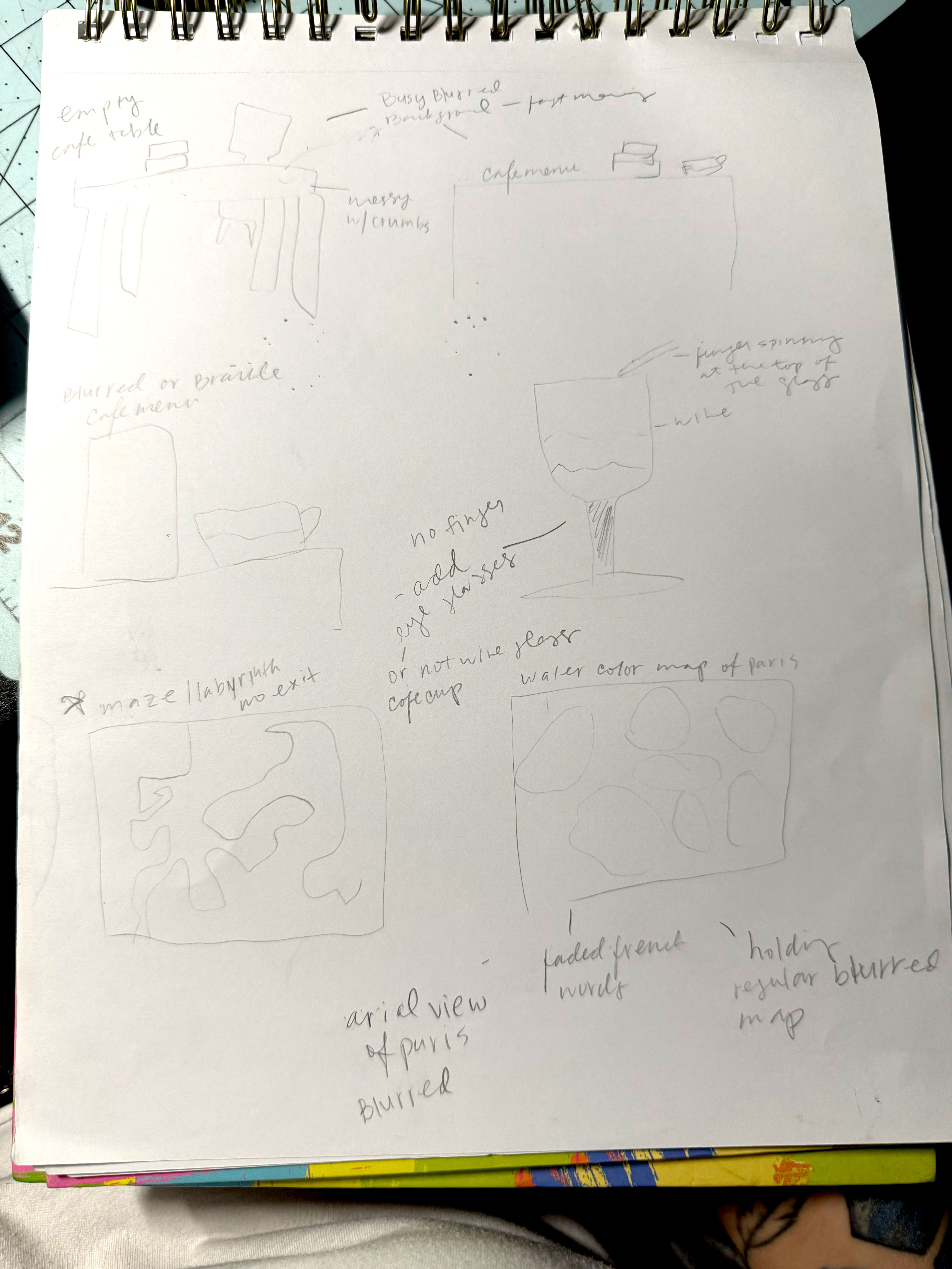
Through brainstorming and word mapping, I identified key themes and symbols for each story. This process helped me distill complex narratives into simple visual concepts that could be effectively represented on the book covers. This approach ensured that the designs were not only visually appealing but also deeply connected to the essence of each story.
These are alternative designs for the book covers.
- The Tapeworm Is In: A never ending labrith maze. The constant frustration when learning anything new, sometimes you feel like you're going in circles, then making progress and finding your way out, then you get lost again.
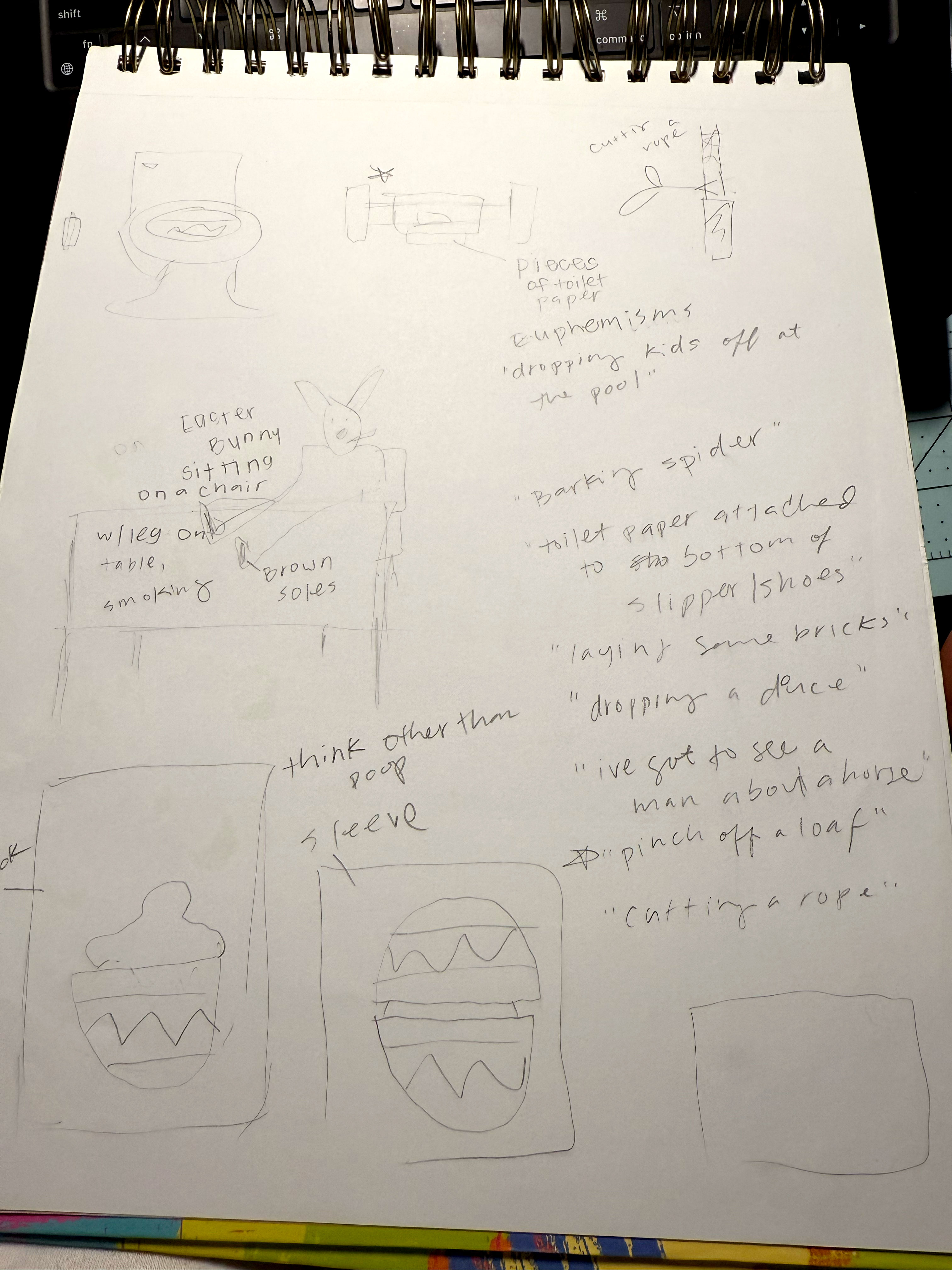
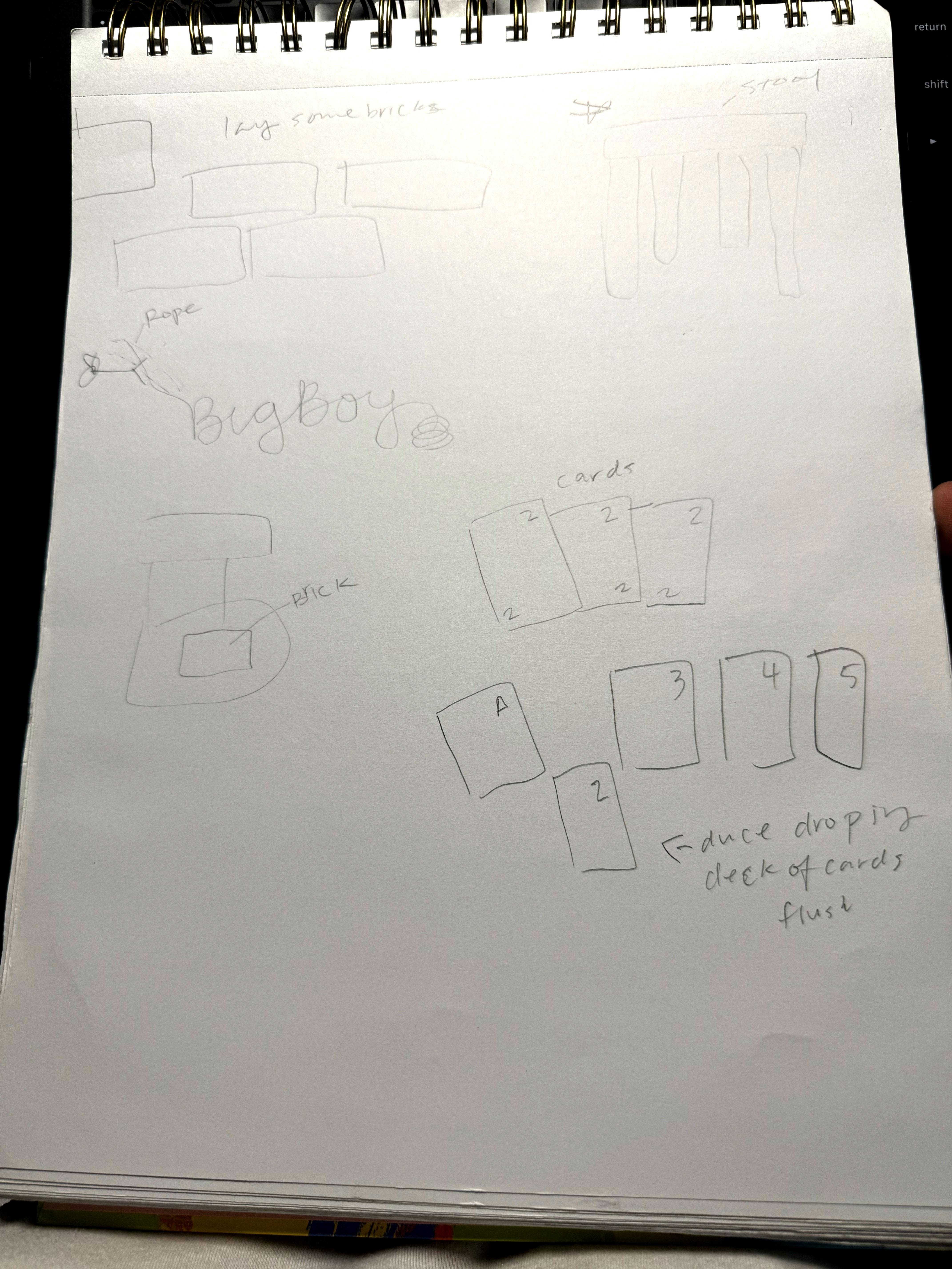
- Big Boy: Ever went to the bathroom and realize the toilet paper roll is empty? That "Aahh SH*T!!" feeling when you don't know what to do. That's the feeling I wanted to portrey for this book cover.
- A Shiner Like A Diamond: A crinkled, torn cookie fortune. No matter what others think of us, how they want us to present ourselves, or what society says about who we should be — what truly matters is how we see ourselves.
Finalization
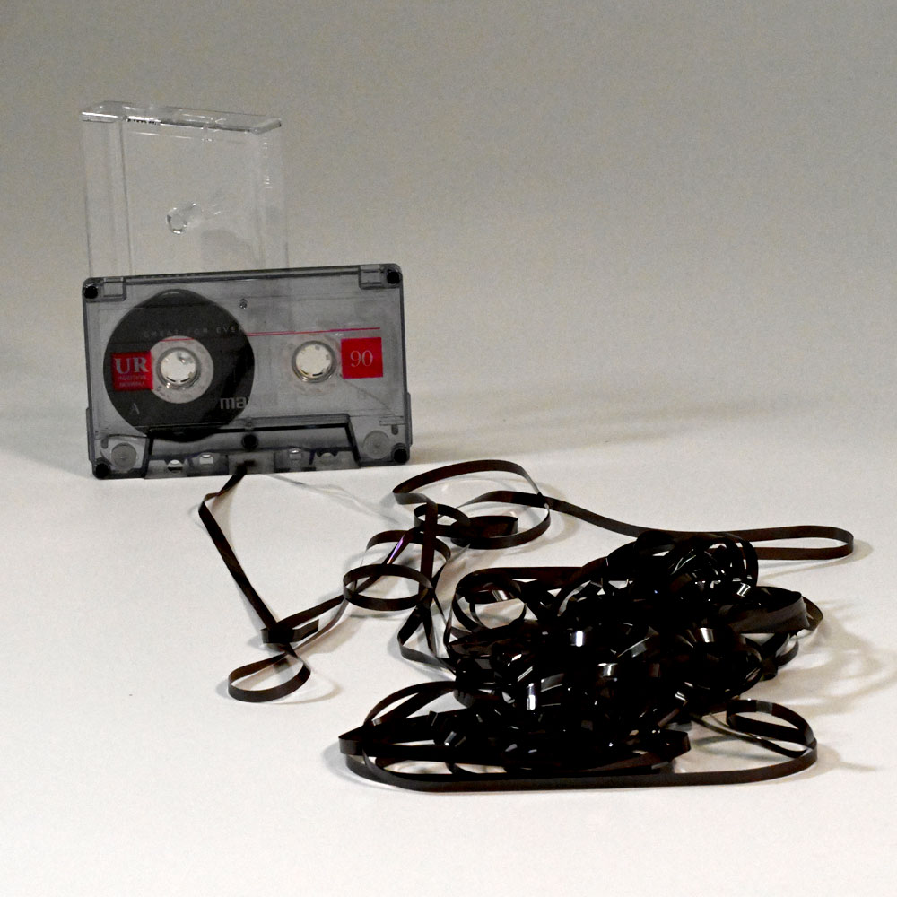
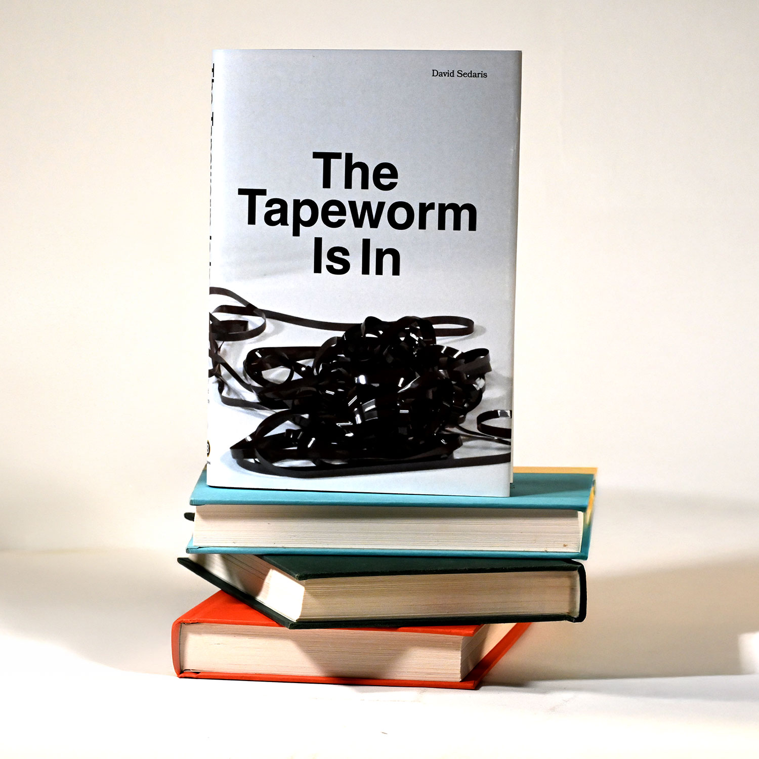
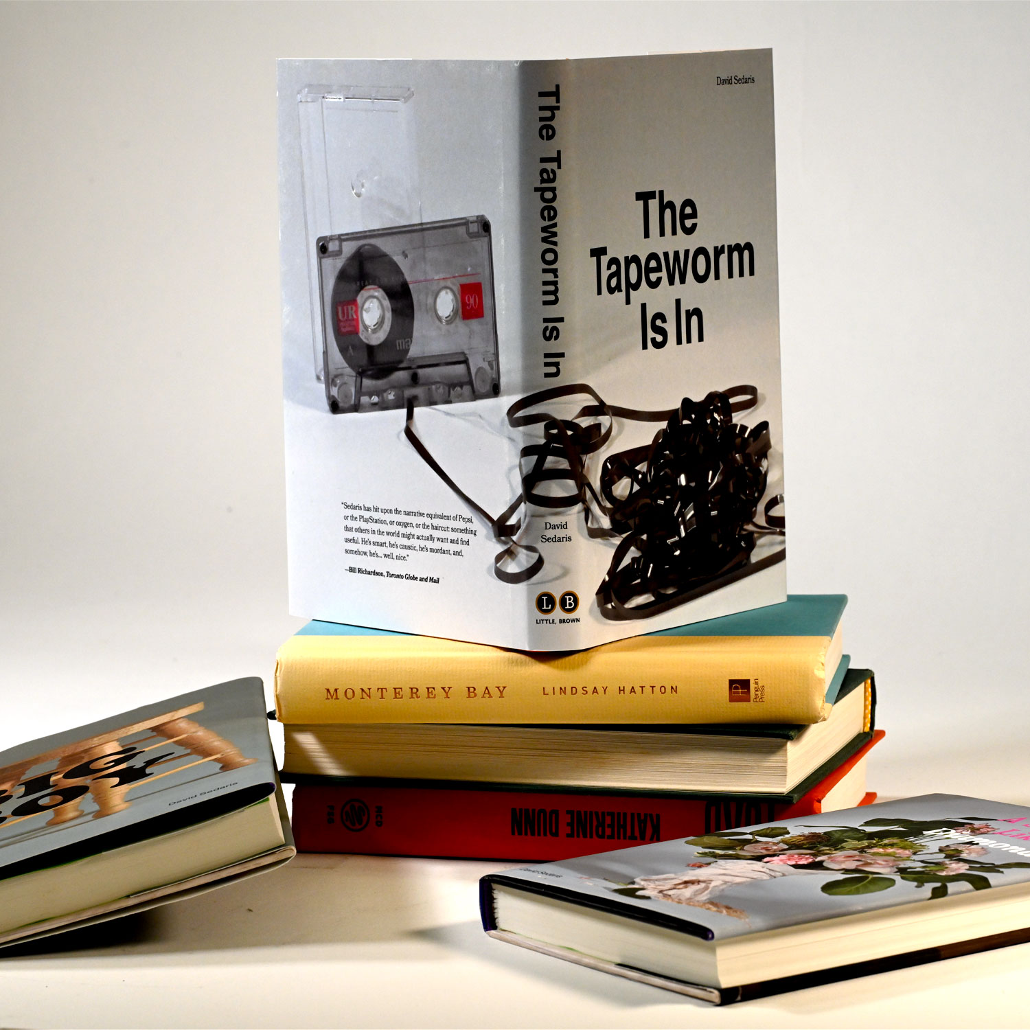
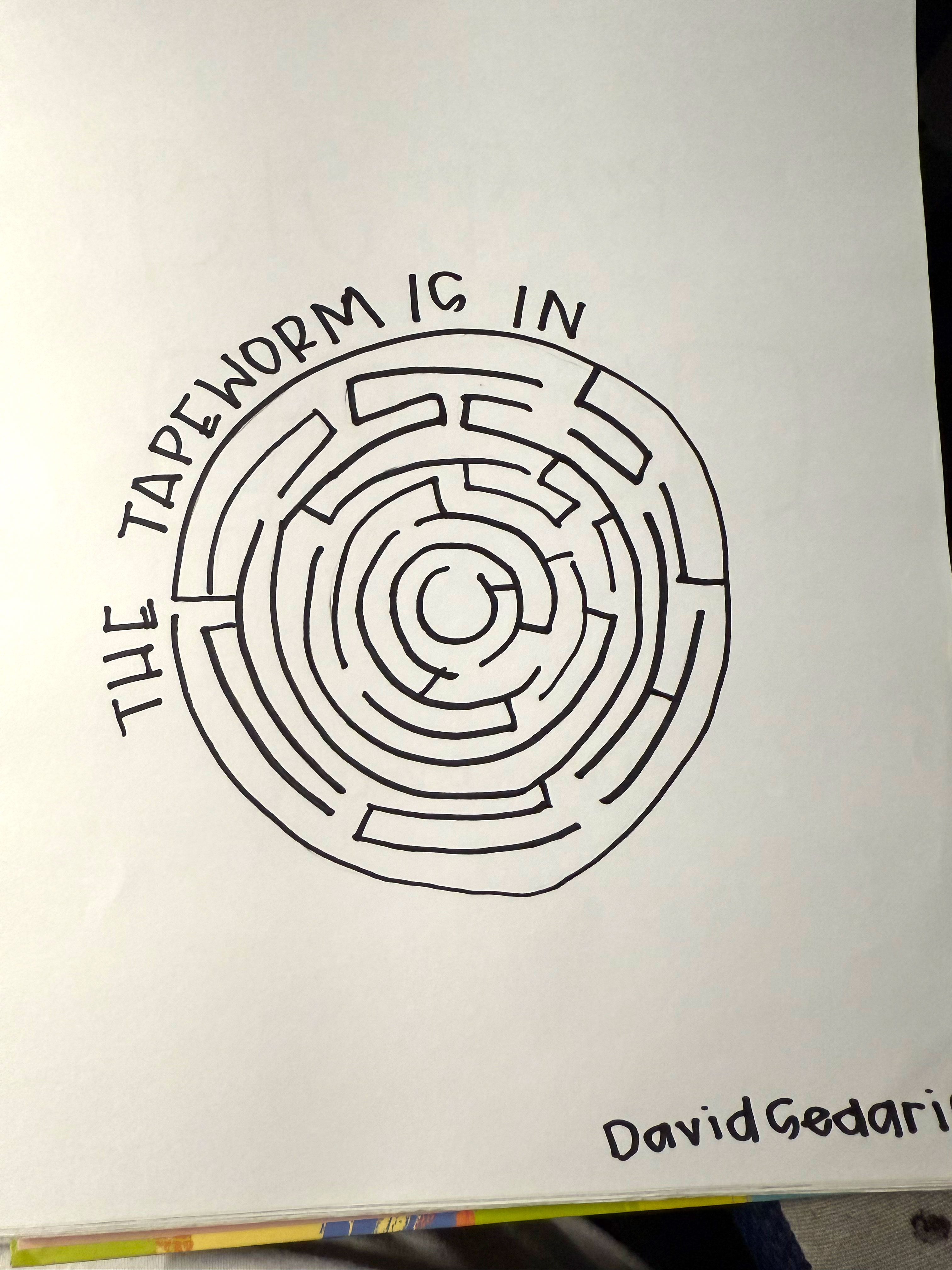
The Tapeworm Is In
David Sedaris describes his efforts to learn French before moving to Paris by taking a beginner's class that uses cassette tapes. He buys a Walkman to listen to the language lessons as he walks around, eventually enjoying tuning out the world with audio. Once in France, he mostly listens to English audiobooks and French phrase tapes—joking that, since avid listeners are “bookworms,” he's become a “tapeworm.”
I chose a cassette tape as the central visual element, this design captures the nostalgic essence of the story. The unravelled tape suggests the tangled, often messy feeling people can have when they're learning something new and unfamiliar. Using Helvetica as the typeface adds a clean, timeless feel that complements the retro vibe of the cassette tape, bridging past and present in a simple yet effective way.
Listen to "The Tapeworm Is In"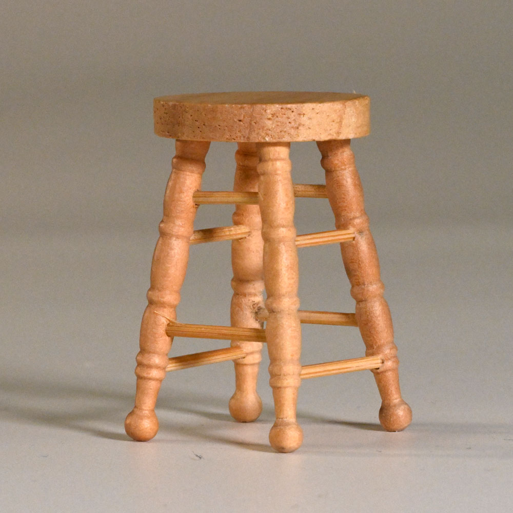
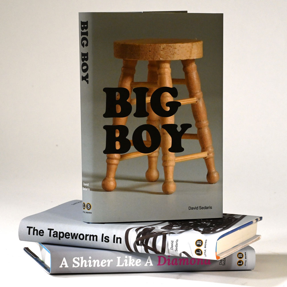
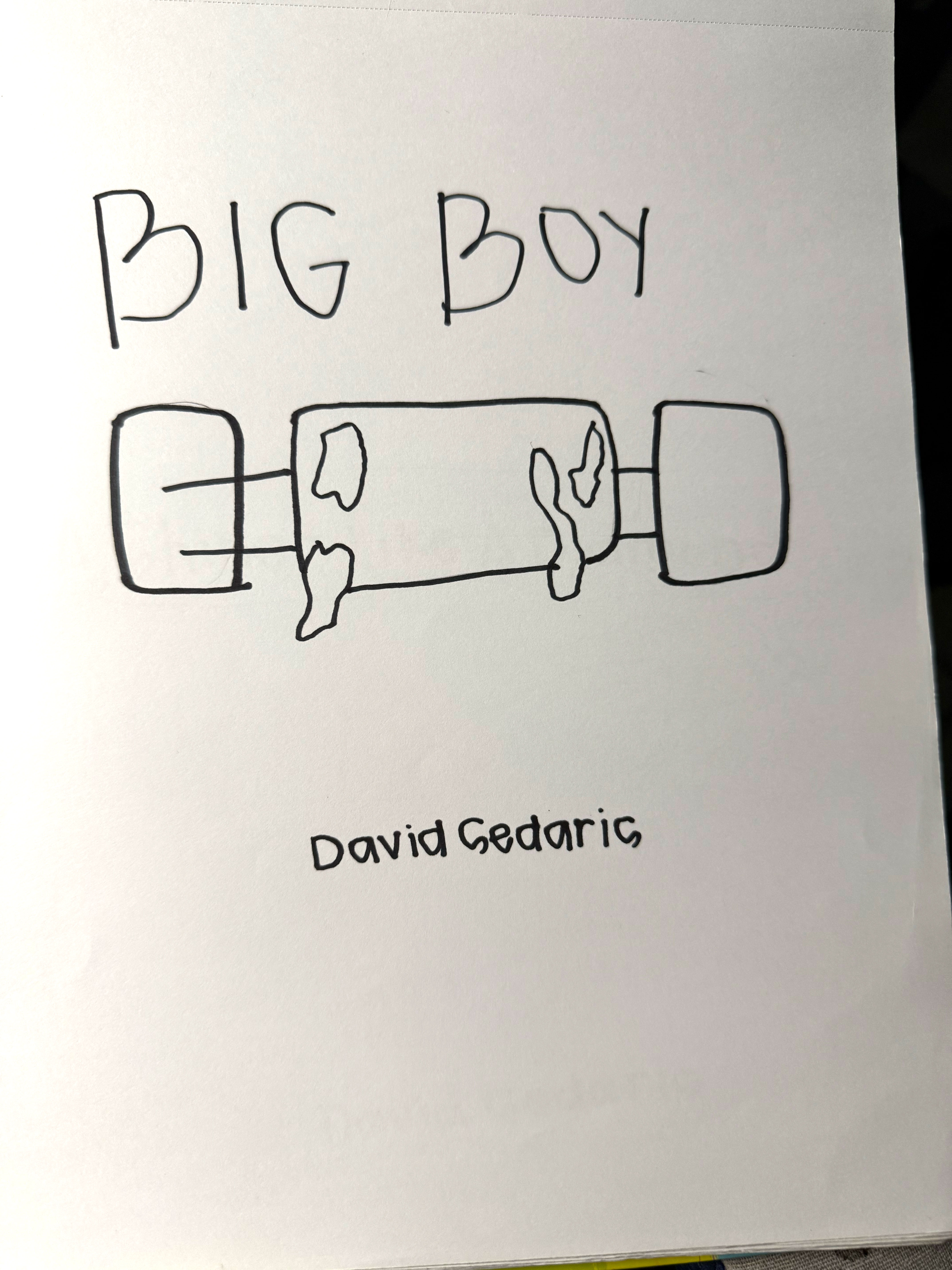
Big Boy
David Sedaris recounts a mortifying moment at a friend's Easter dinner when he goes to the bathroom and finds an enormous piece of feces left in the toilet. Shocked and determined not to be blamed for it—especially after having told everyone where he'd gone—he repeatedly tries to flush it, grows increasingly panicked when it won't budge, and even considers drastic solutions before finally using a plunger to break it up and flush it away.
Going with euphemism for the cover, I selected a simple wooden stool to represent what David found in the toilet. Placing Copperplate Std in big, bold type reinforces the playful yet bold tone of the story, while the stool visual nods to the humor and euphemistic approach to an everyday, embarrassing situation.
Listen to "Big Boy"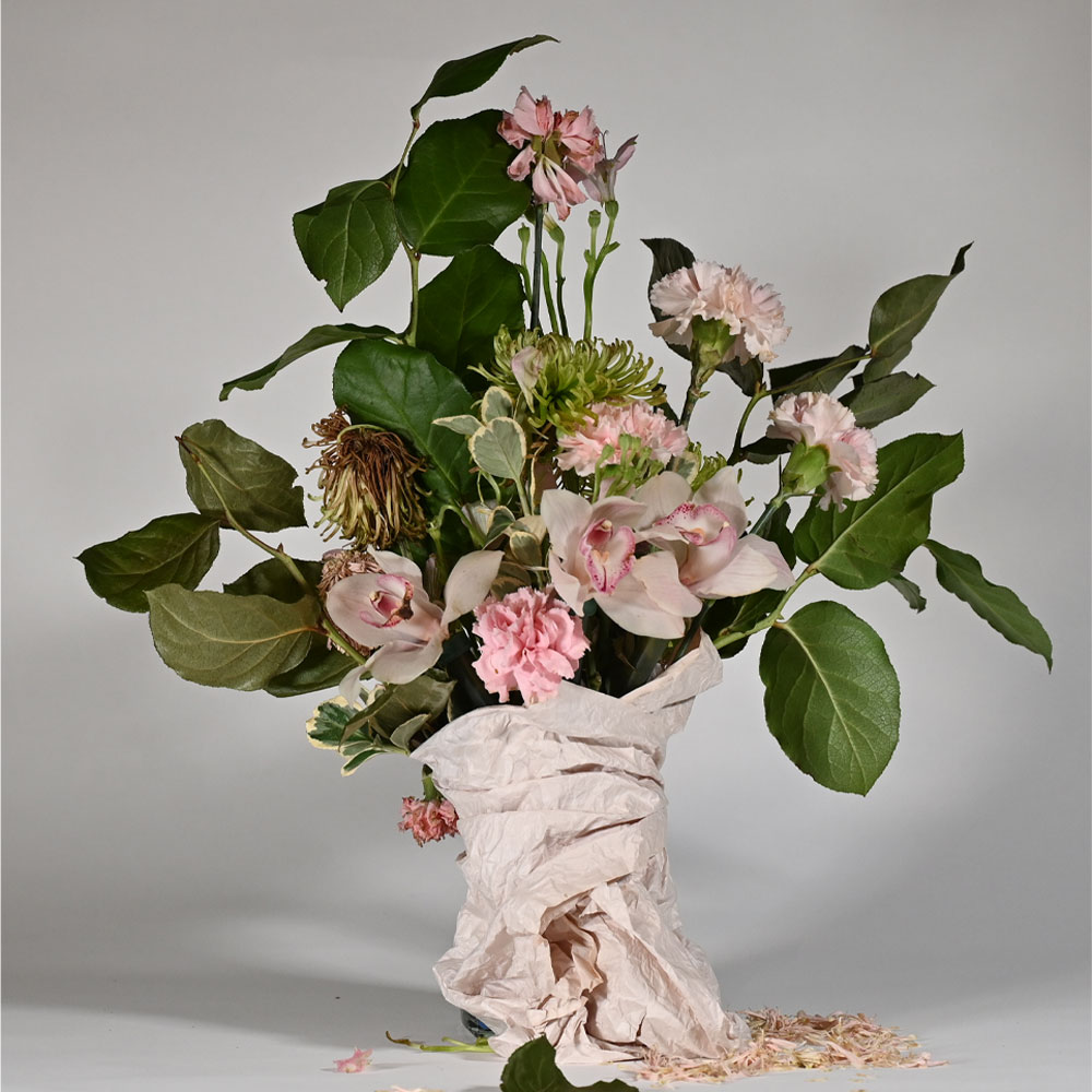
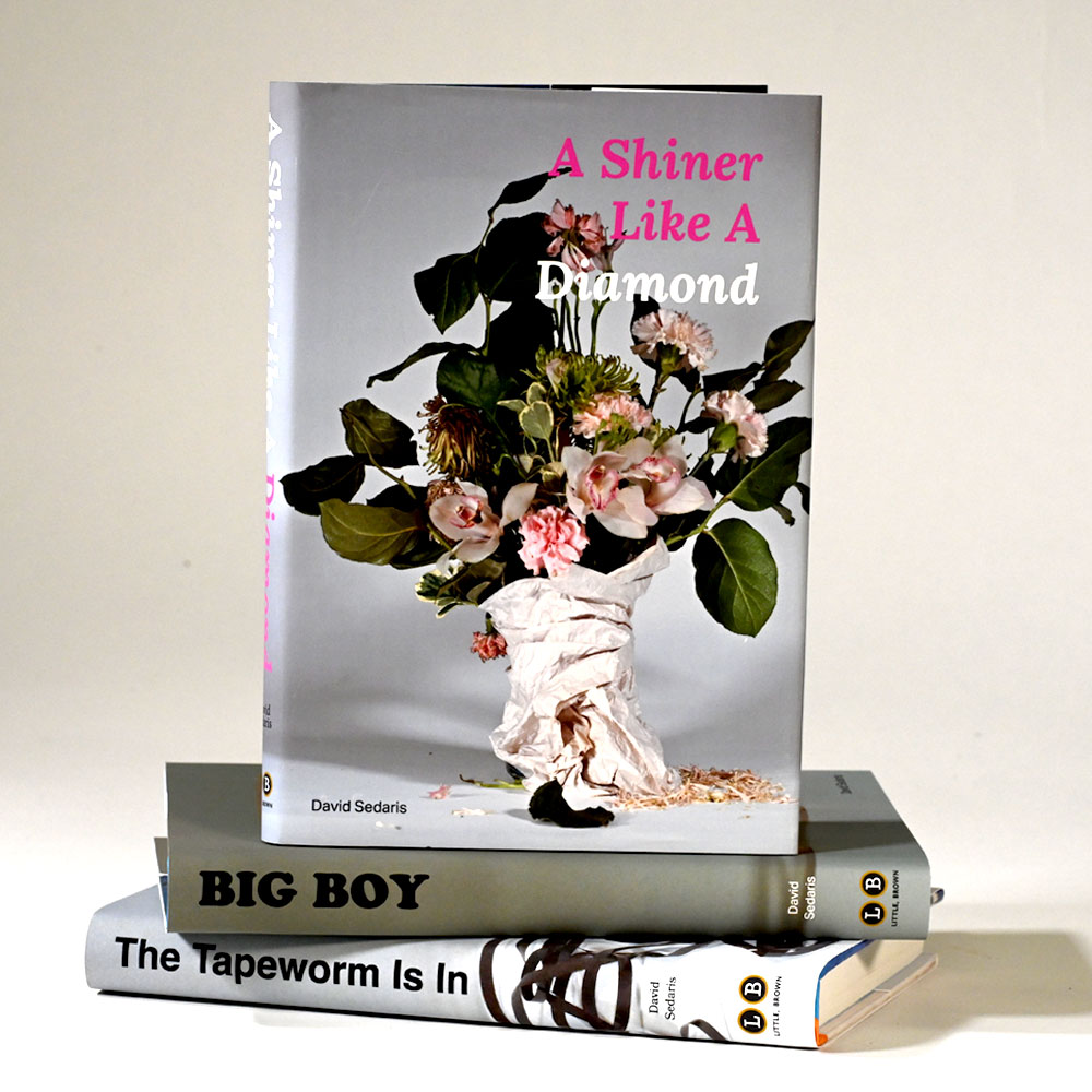
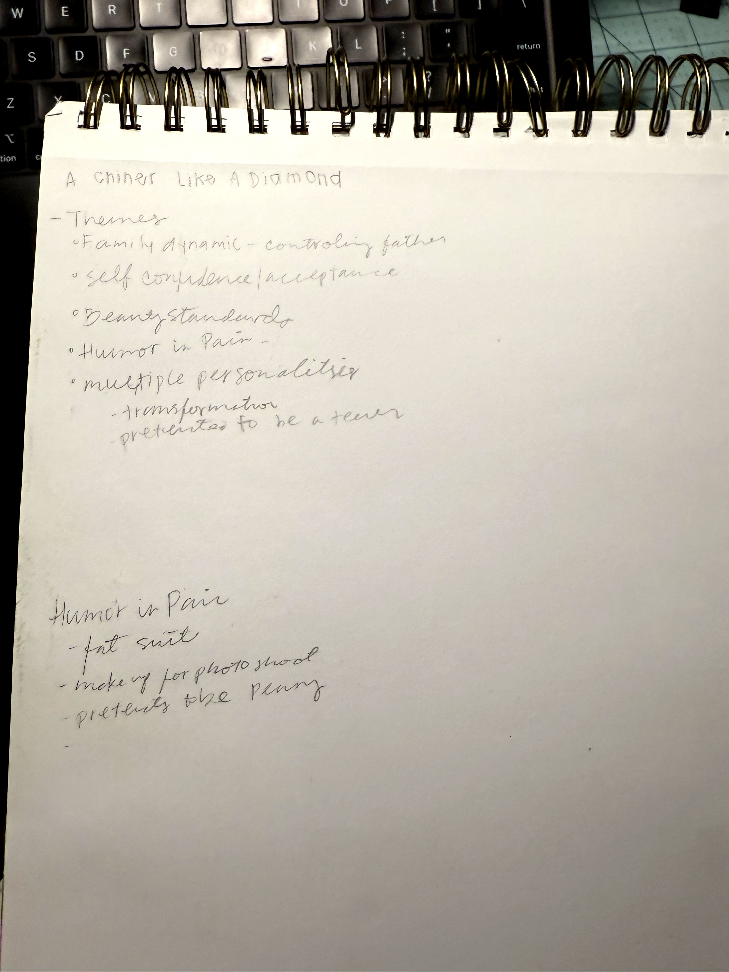
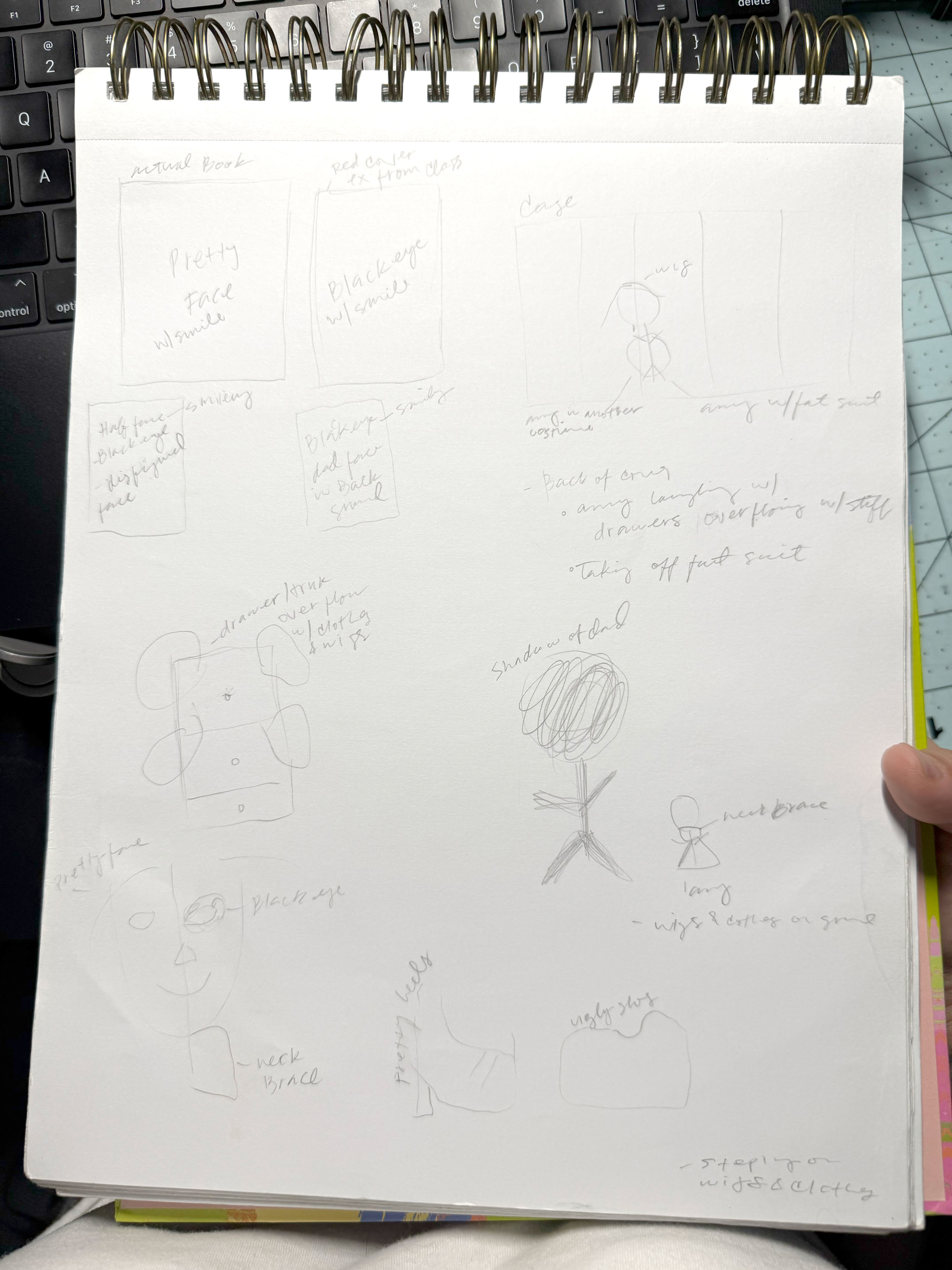
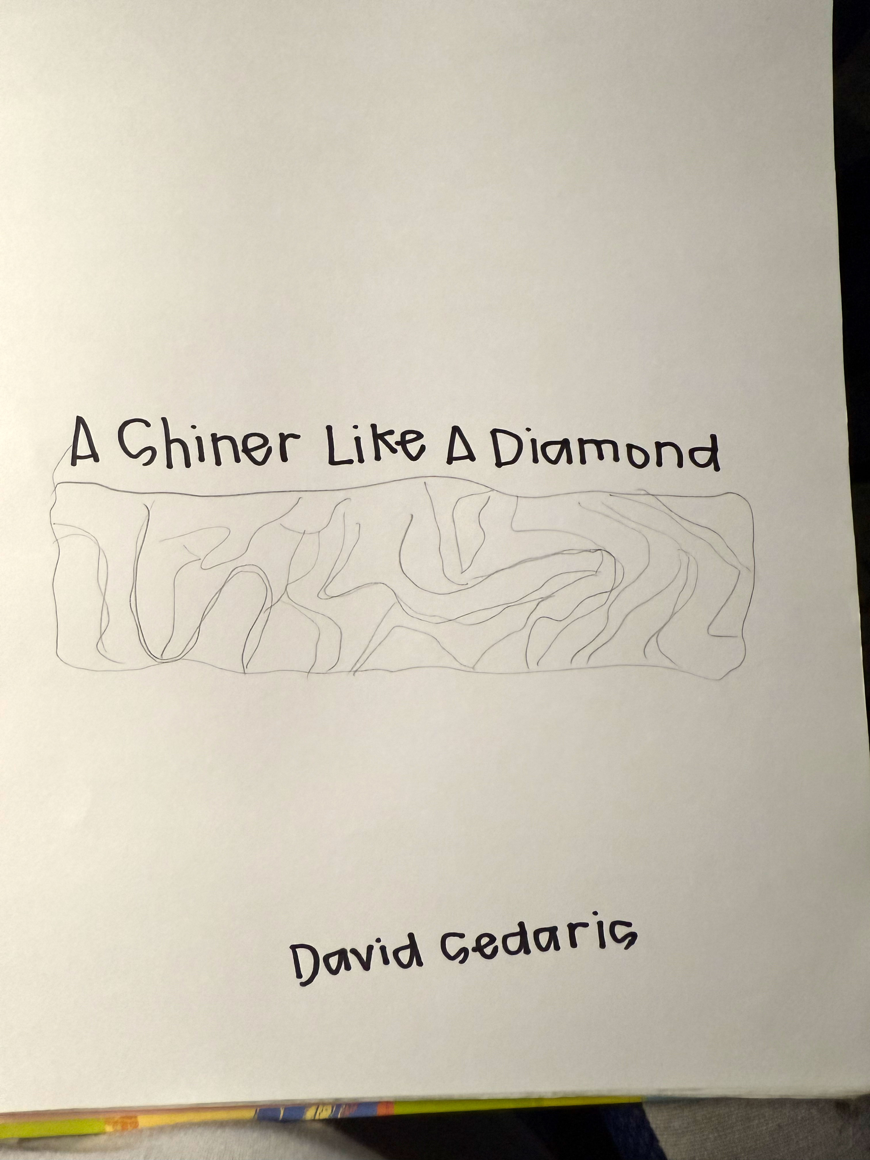
A Shiner Like A Diamond
David Sedaris reflects about his sister, Amy, being featured in a magazine. Their father is thrilled and constantly praises her beauty, revealing his old-fashioned belief that looks are a woman's greatest asset. Amy, however, doesn't care about conforming to his expectations and even pokes fun at him with jokes and disguises, highlighting the humorous contrast between her personality and their father's fixation on appearance.
I chose a bouquet of dying flowers and crinkled wrapping to minic Amy's request at her photoshoot to look bruised and imperfect. On the back cover, a faint glimpse of a studio light subtly references the magazine photoshoot. I used Lora Bold Italic gives the design an elegant, sophisticated feel that reflects Amy's presence and subverts her father's outdated views on beauty.
Listen to "A Shiner Like A Diamond"