Front-End Design
the scope
Year: Fall 2025
Client: Fit For A Goddess
Project Type: UI Design, Front-End Web Development
Deliverable: Website Desing
Duration: Semester
Client: Fit For A Goddess
Project Type: UI Design, Front-End Web Development
Deliverable: Website Desing
Duration: Semester
Softwares: VS Code, Figma, PhotoShop, Illustrator, Cap Cut
Compentencies: Typography, Photography, Videos, Layout, HTML, CSS, JavaScript
Profession: Student
Compentencies: Typography, Photography, Videos, Layout, HTML, CSS, JavaScript
Profession: Student
the challenge
This project involved both redesigning an existing website and bringing that design to life through coding in a separate class. The first phase focused on improving the site's layout, user experience, and visual identity. Once the design was finalized, the next challenge was to build the website using HTML, CSS, and other front-end tools—translating design into a fully functional and responsive web experience.
the solution
I began by analyzing the original website to identify areas for improvement in layout, navigation, and visual appeal. After creating style tiles and wireframes, I focused on building a clean, user-friendly interface that aligned with the brand's goals. Once the redesign was complete, I transitioned into the development phase, where I coded the site using HTML, CSS, and basic JavaScript. I ensured the final product was responsive, accessible, and stayed true to the design vision—creating a seamless experience from concept to launch.
Flow Chart
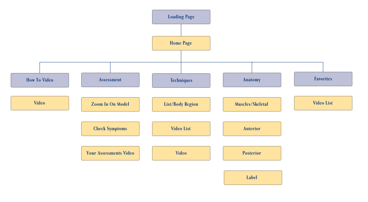
A simple flow that helps the user select a body area, discover guided massage techniques for that area, and access related anatomy and instructional videos.
Style Tiles


This app is a new extension of JKC Wellness. While the brand's core palette of deep blue, white, and light gray has always been its signature, we introduced a subtle accent to reflect the warmth found in the owner's treatment room — hints of gold and copper — while still staying true to the established color system.
To maintain visual consistency across platforms and materials, the app uses the same typefaces as existing brand touchpoints. Lato remains the primary typeface for its clean, versatile, and approachable design, reflecting key aspects of the brand's personality. Orpheus Pro is used for headings to add a touch of elegance and classical proportion, creating a refined contrast that supports hierarchy and visual interest.
With the owner's permission, we tweaked the original gold/copper and deep blue for interactive elements like buttons, shifting them to a soft yellow and pastel blue. These adjusted accent colors still reflect the warmth and personality of the treatment room while working more harmoniously in a digital interface. Using thoughtful color choices for buttons helps make interactive elements stand out and improves clarity for users.
While it's a new extension of JKC Wellness, it reflects the brand's core identity of clear, supportive care. We wanted the app to feel as warm, approachable, and helpful as the in-person experience clients trust.
LoFi & HiFi wireframes
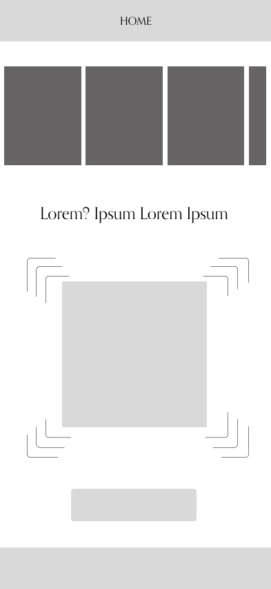
Home Page — See various videos, get an Assessment, & navigate through the app
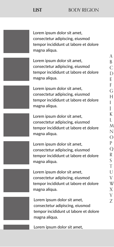
Technique Page — A guide to massage methods for various parts of the body
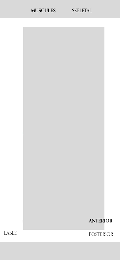
Anatomy Page — Learn about the muscular and skeletal anatomy related to massage
techniques
Home Page
Technique Page
Anatomy Page
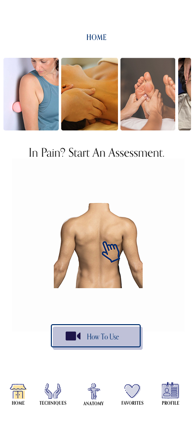
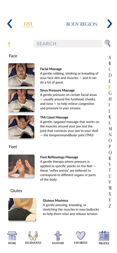
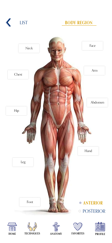
Both lo-fi and hi-fi wireframes to shape the app's design. Lo-fi helped us sketch ideas and layout quickly, while hi-fi brought the design to life with more detail. This two-stage process reflects JKC Wellness's focus on thoughtful, user-centered design that feels clear and supportive.
Buttons, Images, & Icons
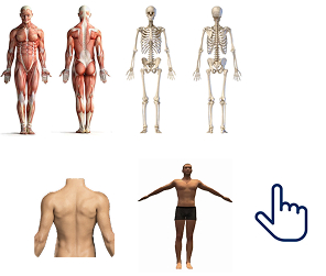
The button design was influenced by certain illustrations and the offset background color used on JKC Wellness's website. The images and 2D model was found on Google.
Images found on Google
Icons found on Icons8

Customized Buttons
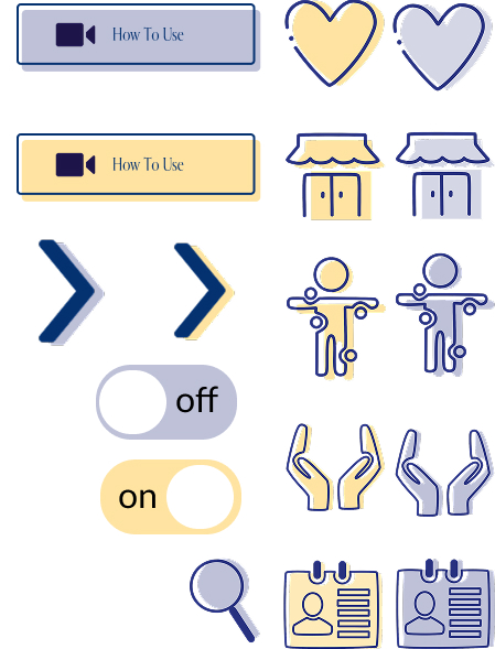
Buttons, images, and icons were designed to be clear, friendly, and easy to understand — supporting smooth interaction while reflecting JKC Wellnesss's warm, approachable style.