Guided Massage
Mobile App Design
Scope
Client: College
Project Type: App Design
Compentencies: Photography, Typography, Layout, Composition
Software: Figma, Photoshop, Illustrator, After Effects, CapCut
Challenge
I was inspired by the many massage and anatomy apps available, but quickly noticed a common problem: users often had to switch between multiple separate apps just to learn anatomy and follow massage guidance. This made finding information confusing and interrupted the flow of self-care. The real challenge was how to bring all of these helpful tools together in a way that felt seamless and easy to use.
Solution
Instead of spreading features across several different apps, I combined the most useful elements into one cohesive, user-friendly tool. Now, you can explore anatomy, follow guided massage instructions, and access everything you need for self-massage or helping others—all in one place. This unified approach simplifies the experience and makes massage learning and relief more accessible to everyone.
Flow Chart
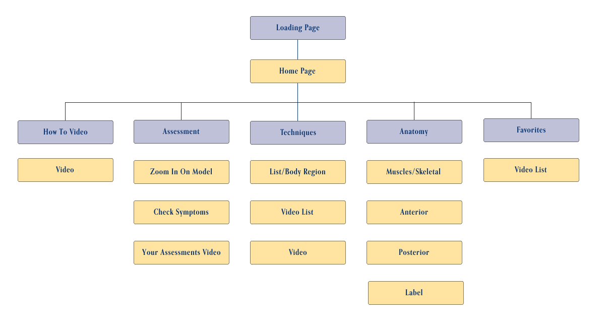
A simple flow that helps the user select a body area, discover guided massage techniques for that area, and access related anatomy and instructional videos.
Branding & Assets

This app is a new extension of JKC Wellness. While the brand's core palette of deep blue, white, and light gray has always been its signature, we introduced a subtle accent to reflect the warmth found in the owner's treatment room—hints of gold and copper—while still staying true to the established color system.
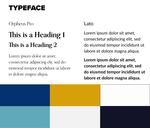
To maintain visual consistency across platforms and materials, the app uses the same typefaces as existing brand touchpoints. Lato remains the primary typeface for its clean, versatile, and approachable design, reflecting key aspects of the brand's personality. Orpheus Pro is used for headings to add a touch of elegance and classical proportion, creating a refined contrast that supports hierarchy and visual interest.
With the owner's permission, we tweaked the original gold/copper and deep blue for interactive elements like buttons, shifting them to a soft yellow and pastel blue. These adjusted accent colors still reflect the warmth and personality of the treatment room while working more harmoniously in a digital interface. Using thoughtful color choices for buttons helps make interactive elements stand out and improves clarity for users.
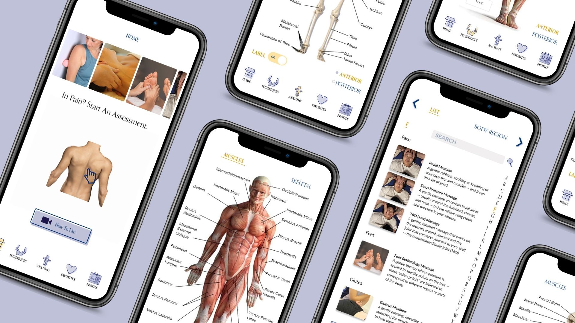
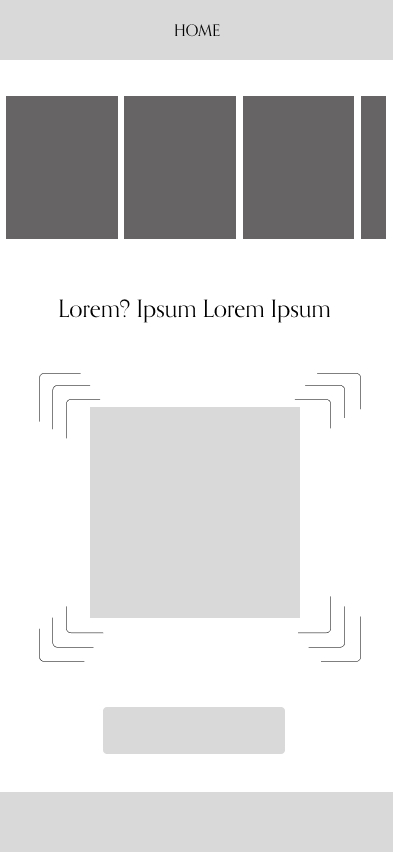
Single Page Wireframe
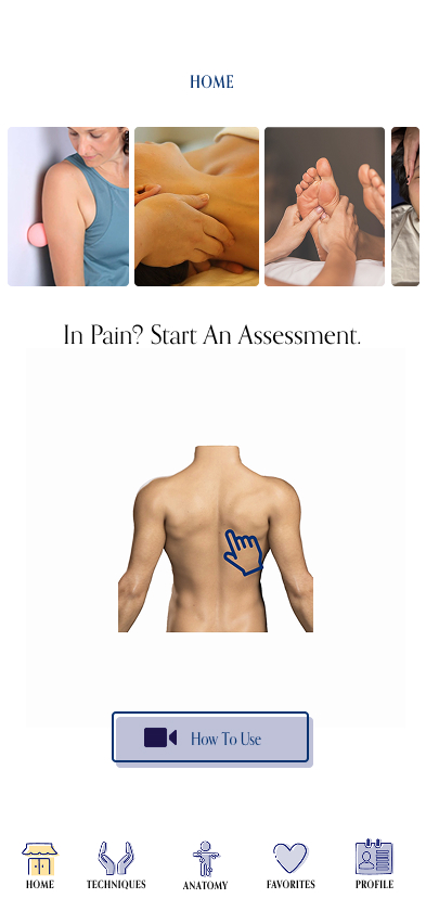
See various videos, get an Assessment, & navigate through the app.
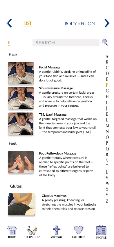
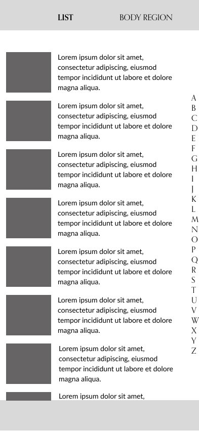
A guide to massage methods for various parts of the body.
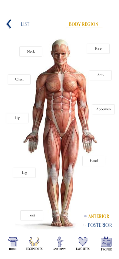
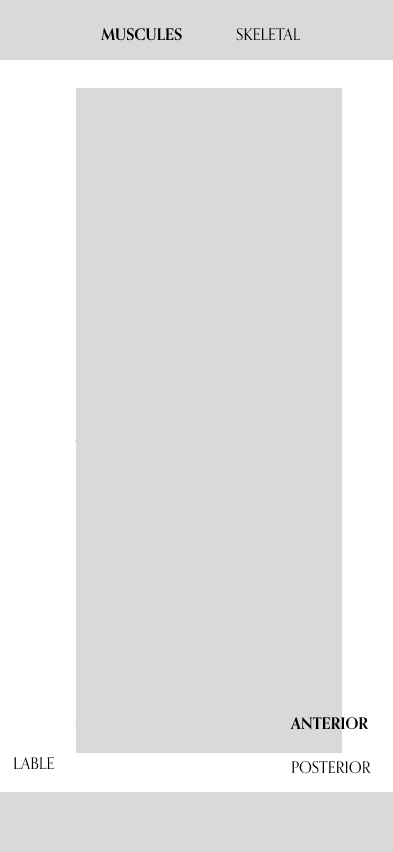
Learn about the muscular and skeletal anatomy related to massage techniques.
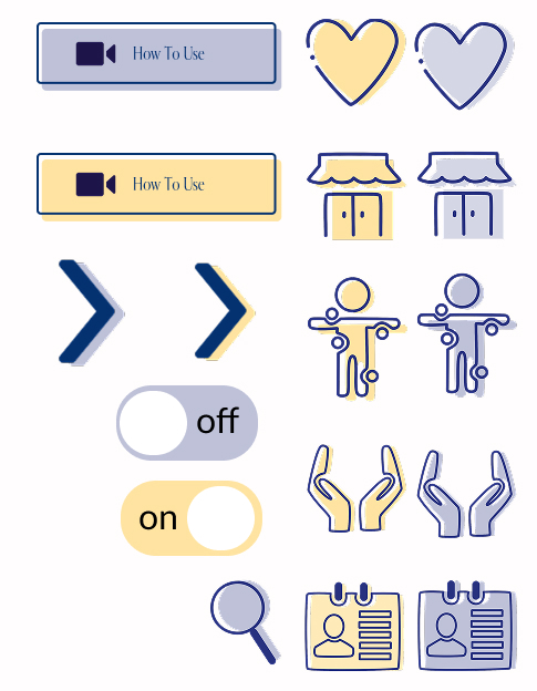
Buttons, Images, & Icons
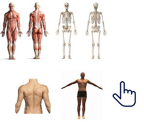
The button design was influenced by certain illustrations and the offset background color used on JKC Wellness's website. The images and 2D model was found on Google.
Images found on Google
Icons found on Icons8

Customized Buttons