JKC Wellness
Front-End Web Development & UI Design
Scope
Client: JKC Wellness
Project Type: Web Design
Compentencies: Photography, Typography, Layout, Composition
Software: Figma, Photoshop, Illustrator, After Effects, CapCut
Challenge
For this project, I designed a website for my private practice. I learned to remove my personal expectations and preferences and focus on constructive feedback to enhance the design.
Solution
My original design concept was minimal, but as my teachers and peers provided feedback, my personality didn't shine through. I revised the design to better reflect my brand identity while maintaining simplicity and ease of use. I like when things are organized, connected, and easy to understand, so I focused on creating a structured and user-friendly layout.
Site Map
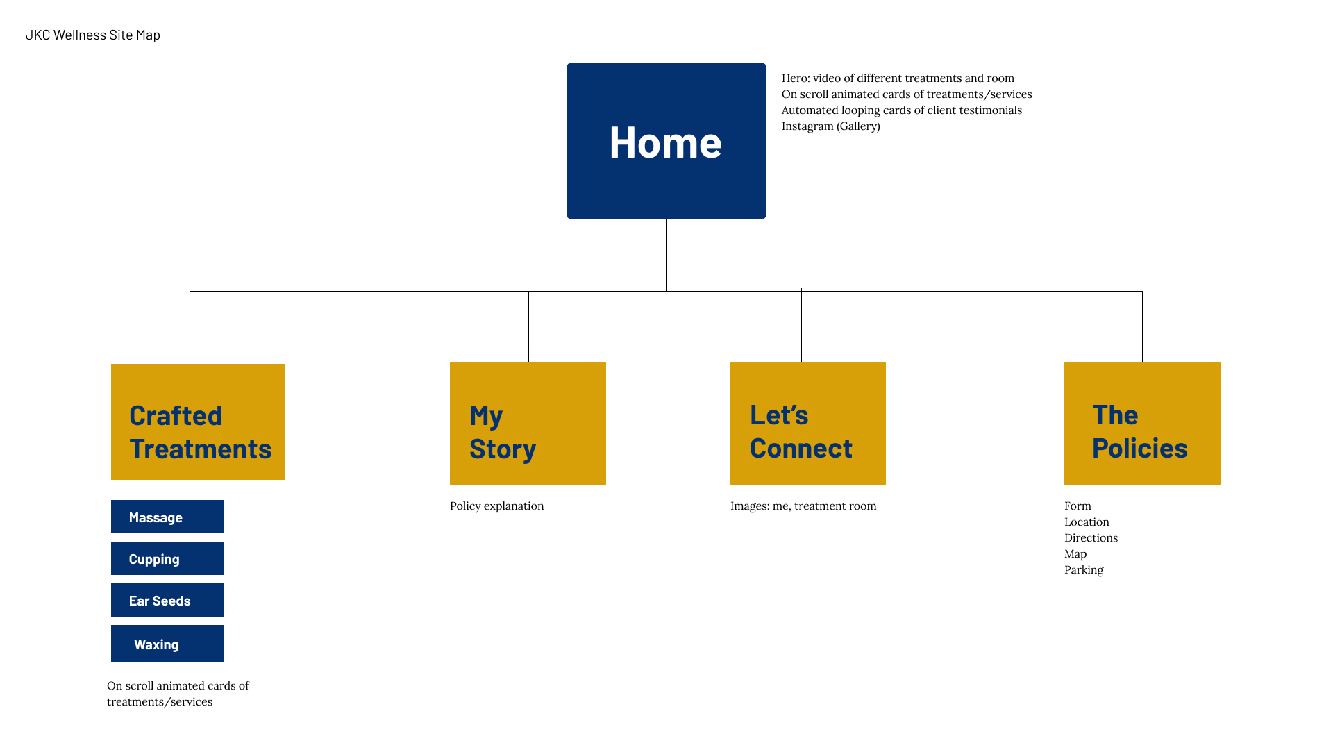
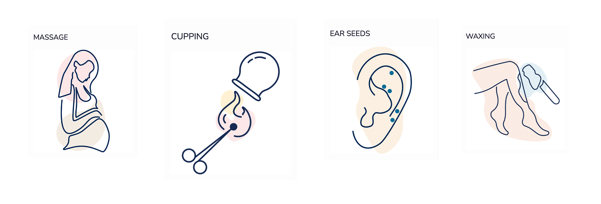
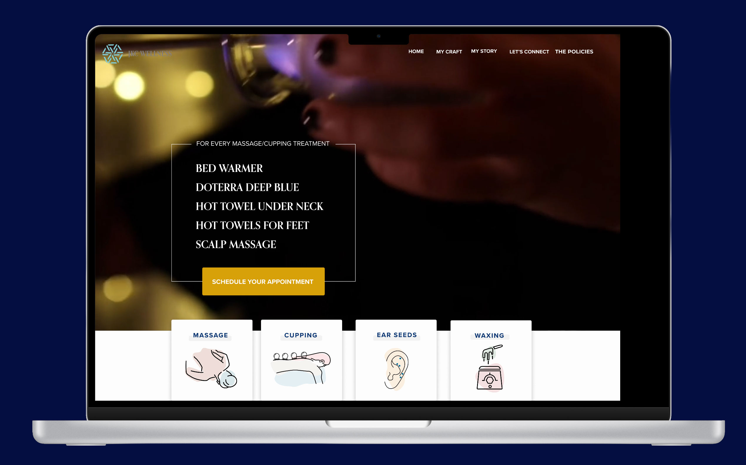
A streamlined site map that has a simple, easy-to-use navigation. The top menu links to Home, Crafted Treatments (like Massage Therapy, Cupping, Ear Seeds, and Waxing), My Story, Let's Connect, and The Policies. A quick links section at the bottom repeats the main pages and contact info so visitors can easily find services, location, hours, and ways to book or reach out.
Branding & Assets
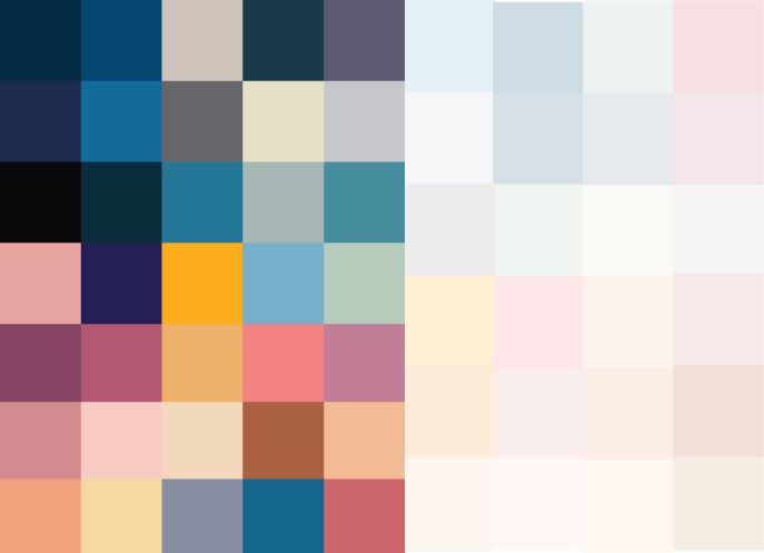
In an unconventional approach, I wanted a broader range of colors than the typical 3-6-color palette. I preferred additional color options—not bright primary hues, but more nuanced tones that would complement the warm feel of her room. Along with expanding the selection, I created muted shades, which, to my surprise, worked beautifully as subtle accents alongside the simple line illustrations and icons.
JKC Wellness's main color has always been a deep blue with hints of white and light gray, I wanted to give an option with a pop of color—although not a part of her traditional wheel house, the owner does have subtle hints of gold & copper in her treatment room.
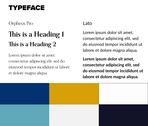
For the typeface, I wanted a sense of elegance and classical proportion. Orpheus Pro delivered a refined yet understated sophistication, creating contrast that reinforces visual hierarchy and interest. For the primary typeface, I sought a design that was clean, versatile, and welcoming—qualities that perfectly align with the brand's personality, which Lato successfully fulfilled
LoFi & HiFi Wireframe
Personalized holistic treatments like massage, cupping, ear seeds, and waxing, and shares contact details, location, and policies for scheduling in Honolulu.
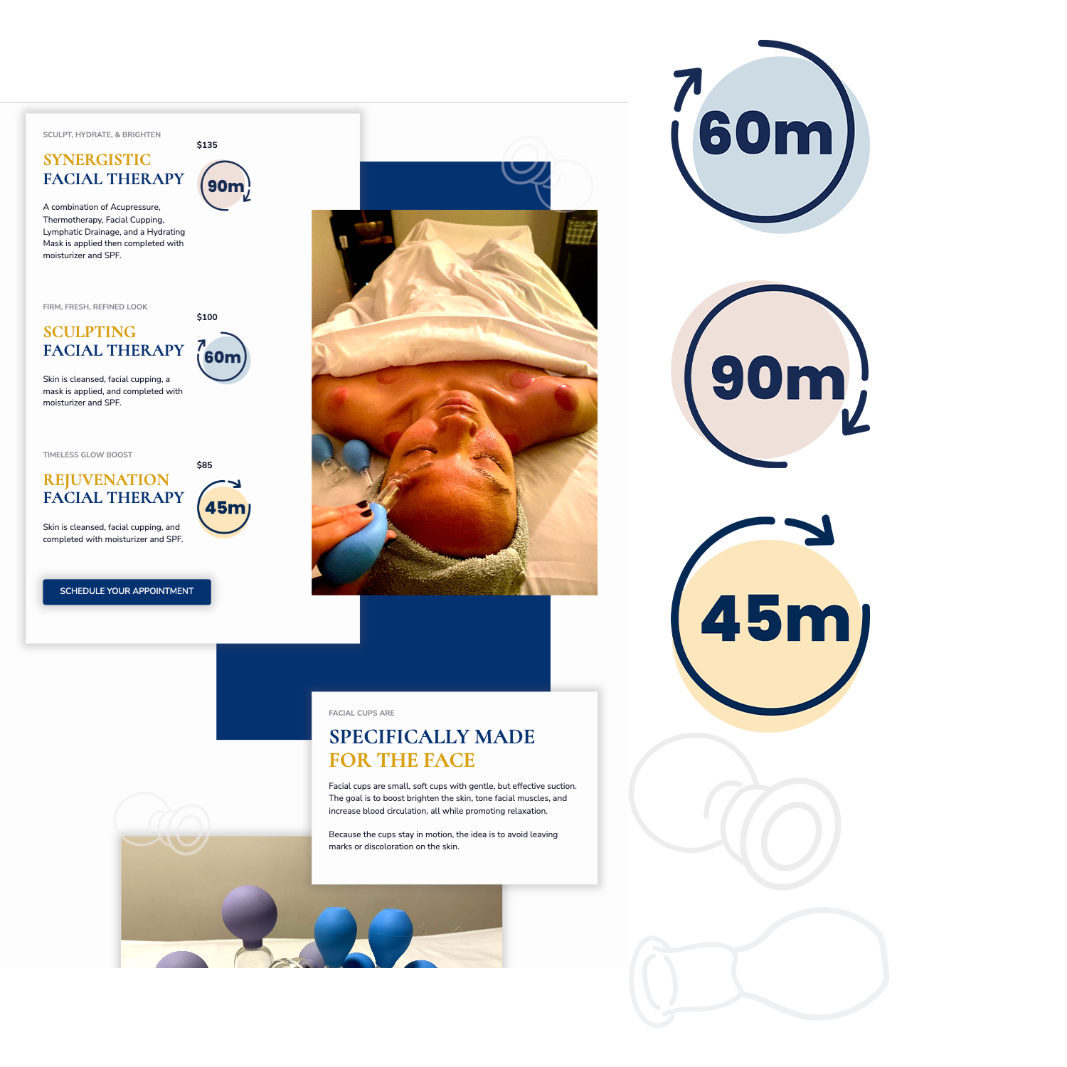
Showcases customized full-body, prenatal, and foot reflexology massages with clear descriptions of each treatment and pricing, and invites visitors to schedule an appointment for relaxation and therapeutic care in Honolulu.
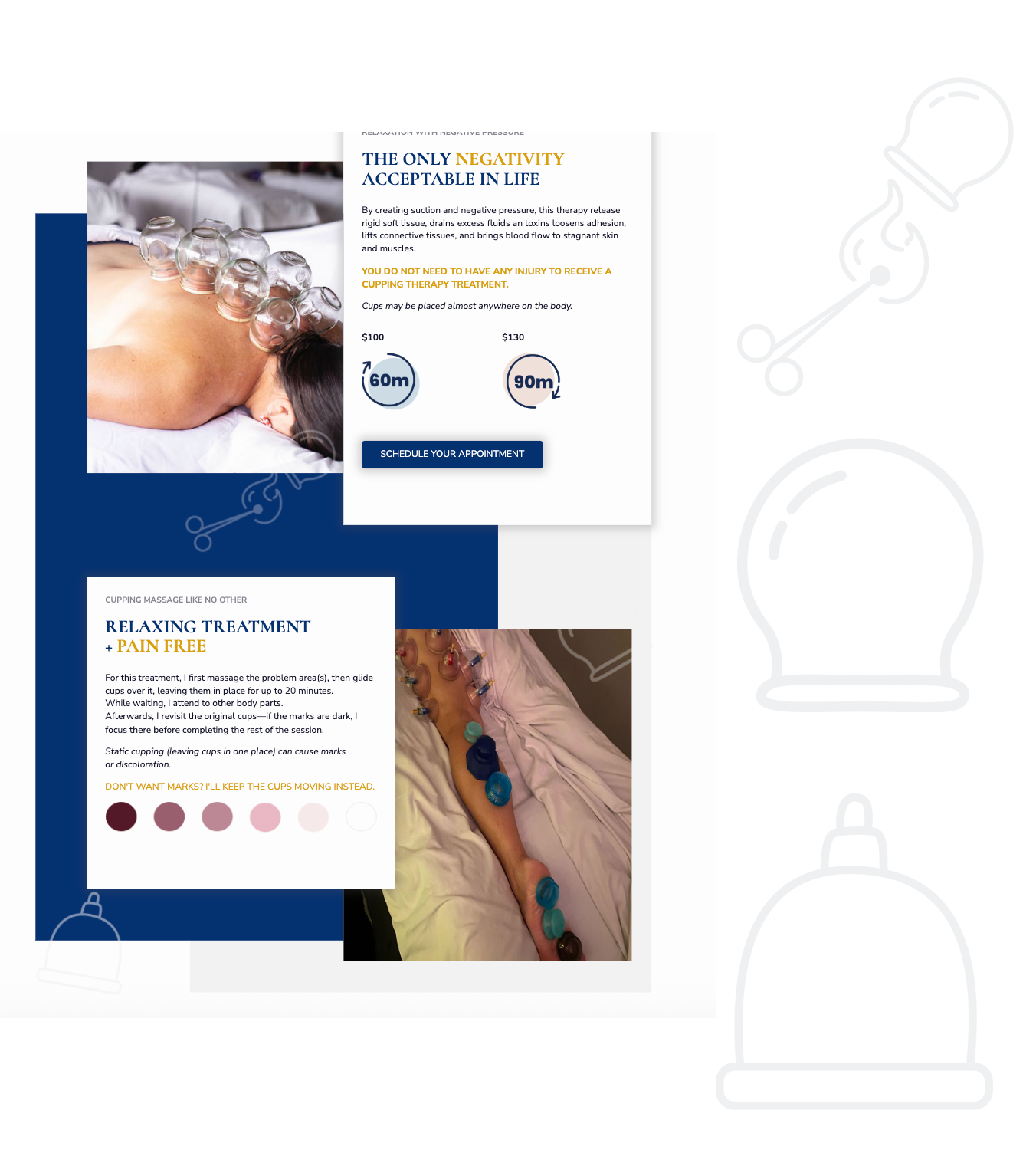
Explains how suction-based body cupping uses negative pressure to relax tissues, improve circulation, and support overall wellness, and also describes different cup types and options for facial and body cupping with pricing and booking details.
See the full lofi & hifi wireframe
I values things that are organized, connected, and easy to understand. With that in mind, the wireframe and design were created to reflect structure and simplicity.
Customized Illustrations and Icons
Staying true to the minimalist theme the owner wanted, I paired simple line drawings with abstract blob art and soft, and muted tones.

menu cards
menu cards hover images